Tkinter 8.5 reference: a GUI for Python |  |
Tkinter 8.5 reference: a GUI for Python | |
The purpose of the ttk.Treeview widget is to
present a hierarchical structure so that the user can use mouse
actions to reveal or hide any part of the structure.
The association with the term “tree” is due to
programming practice: tree structures are a commonplace in
program design. Strictly speaking, the hierarchy shown in a
Treeview widget is a forest: there is no one
root, just a collection of top-level nodes, each of which may contain second-level
nodes, each of which may contain third-level nodes, and so on.
You may have encountered this particular presentation as a way of browsing a directory or folder hierarchy. The entire hierarchy is displayed like an indented outline, where each directory is on a separate line, and the subdirectories of each directory are displayed underneath that line, indented:
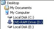
The user can click on the icon for a directory to collapse (close) it, hiding all of the items in it. They can also click again on the icon to expand (open) it, so that the items in the directory or folder are shown.
The Treeview widget generalizes this concept
so that you can use it to display any hierarchical structure,
and the reader can collapse or expand subtrees of this
structure with the mouse.
First, some definitions:
One of the entities being displayed in the widget. For a file browser, an item might be either a directory or a file.
Each item is associated with a textual label, and may also be associated with an image.
Every item in the tree has a unique identifier string called the iid. You can supply the iid values yourself, or you can let ttk generate them.
The items directly below a given item in a hierarchy. A directory, for example, may have two kinds of children: files and subdirectories.
For a given item, if it is at the top of the hierarchy it is said to have no parent; if it is not at the top level, the parent is the item that contains it.
The ancestors of an item include its parent, its parent's parent, and so on up to the top level of the tree.
Top-level items are always visible. Otherwise, an item is visible only if all its ancestors are expanded.
The descendants of an item include its children, its childrens' children, and so on. Another way of saying this is that the subtree of an item includes all its descendants.
Your program can associate one or more tag strings with each item. You can use
these tags to control the appearance of an item. For
example, you could tag directories with the tag 'd' and files with the tag 'f',
and then specify that items with tag 'd'
use a boldface font.
You may also associate events with tags, so that certain events will cause certain handlers to be called for all items that have that tag. For example, you could set up a file browser so that when a user clicks on a directory, the browser updated its contents to reflect the current file structure.
Your Treeview widget will be structured with
multiple columns. The first column, which we'll call the
icon column, displays the icons that
collapse or expand items. In the remaining columns, you may
display whatever information you like.
For example, a simple file browser widget might use two columns, with the directory icons in the first column and the directory or file name in the second columns. Or you might wish to display file sizes, permissions, and other related data in additional columns.
The operations of the Treeview widget even allow
you to use it as a tree editor. Your program can remove an
entire subtree from its location in the main tree and then
attach it later at an entirely different point.
Here is the general procedure for setting up a Treeview widget.
Create the widget with the ttk.Treeview
constructor. Use the columns keyword
argument to specify the number of columns to be displayed
and to assign symbolic names to each column.
Use the .column() and .heading() methods to set up column headings (if you want them) and
configure column properties such as size and stretchability.
Starting with the top-level entries, use the .insert() method to populate the tree. Each call
to this method adds one item to the tree. Use the open keyword argument of this method to specify
whether the item is initially expanded or collapsed.
If you want to supply the iid value for this item, use the
iid keyword argument. If you omit this
argument, ttk will make one up and return it as the
result of the .insert() method call.
Use the values keyword argument of this
method to specify what should appear in each column of this
item when it is visible.
To create a Treeview widget within a given parent
w= ttk.Treeview(parent,option=value, ...)
The constructor returns the new Treeview widget.
Its options include:
class_
| You may provide a widget class name when you create this widget. This name may be used to customize the widget's appearance; see Section 27, “Standardizing appearance”. Once the widget is created, the widget class name cannot be changed. | |||||||||||||||||||||||||
columns
|
A sequence of column identifier strings. These
strings are used internally to identify the columns
within the widget. The icon column, whose identifier
is always
The columns you specify with the
For example, if you specified | |||||||||||||||||||||||||
cursor
| Use this option to specify the appearance of the mouse cursor when it is over the widget; see Section 5.8, “Cursors”. The default value (an empty string) specifies that the cursor is inherited from the parent widget. | |||||||||||||||||||||||||
displaycolumns
|
Selects which columns are actually displayed and determines the order of their presentation. Values may be:
| |||||||||||||||||||||||||
height
| The desired height of the widget, in rows. | |||||||||||||||||||||||||
padding
|
Use this argument to place extra space around the contents inside the widget. You may provide either a single dimension or a sequence of up to four dimensions, interpreted according to this table:
| |||||||||||||||||||||||||
selectmode
|
This option controls what the user is allowed to select with the mouse. Values can be:
| |||||||||||||||||||||||||
show
|
To suppress the labels at the top of each column,
specify show='tree'. The default is to
show the column labels.
| |||||||||||||||||||||||||
style
| Use this option to specify a custom widget style name; see Section 47, “Customizing and creating ttk themes and styles”. | |||||||||||||||||||||||||
takefocus
|
Use this option to specify whether a widget is visited
during focus traversal; see Section 53, “Focus: routing keyboard input”.
Specify takefocus=True if you want the
visit to accept focus; specify takefocus=False if the widget is not to accept
focus. The default value is an empty string; by
default, ttk.Treeview widgets do get
focus.
|
Here are the methods available on a Treeview
widget.
.bbox(item,
          column=None)
For the item with iid item(, where x, y,
w, h)(
are the coordinates of the upper left corner of that item
relative to the widget, and x, y)wh
If the optional column argument is omitted,
you get the bounding box of the entire row. To get the
bounding box of one specific column of the item's row, use
column= where
CC
.column(cidkw)
This method configures the appearance of the logical
column specified by cidcid'#0'.
Each column in a Treeview widget has its
own set of options from this table:
anchor
|
The anchor that
specifies where to position the content of the
column. The default value is 'w'.
|
id
| The column name. This option is read-only and set when the constructor is called. |
minwidth
| Minimum width of the column in pixels; the default value is 20. |
stretch
|
If this option is True, the
column's width will be adjusted when the widget is
resized. The default setting is 1.
|
width
| Initial width of the column in pixels; the default is 200. |
If no option
To interrogate the current value of an option named
X option=.
X
To set one or more column options, you may pass
keyword arguments using the option names shown above,
e.g., anchor=tk.CENTER to center the
column contents.
.delete(*items)
The arguments are iid values. All the items in the widget that have matching iid values are destroyed, along with all their descendants.
.detach(*items)
The arguments are iid values. All the items in the widget that have matching iid values are removed from the visible widget, along with all their descendants.
The items are not destroyed. You may reattach them to the
visible tree using the .move() method
described below.
.exists(iid
Returns True if there exists an item in the
widget with the given iidFalse
otherwise. If an item is not currently visible because it
was removed with the .detach() method, it
is still considered to exist for the purposes of the .exists() method.
.focus([iid])
If you don't provide an argument to this method, you get
back either the iid of the item that currently has focus,
or '' if no item has focus.
You can give focus to an item by passing its iid as the argument to this method.
.get_children([item])
Returns a tuple of the iid values of the children of the
item specified by the item
.heading(cid,
          option=None, **kw)
Use this method to configure the column heading that
appears at the top of the widget for the column specified
by cidcid'#0' to configure the heading over
the icon column.
Each heading has its own set of options with these names and values:
anchor
|
An anchor that specifies how the heading is
aligned within the column; see Section 5.5, “Anchors”. The default value is tk.W.
|
command
| A procedure to be called when the user clicks on this column heading. |
image
| To present a graphic in the column heading (either with or instead of a text heading), set this option to an image, as specified in Section 5.9, “Images”. |
text
| The text that you want to appear in the column heading. |
If you supply no keyword arguments, the method will return a dictionary showing the current settings of the column heading options.
To interrogate the current value of some heading
option Xoption=; the method will return the
current value of that option.
X
You can set one or more heading options by supplying
them as keyword arguments such as “anchor=tk.CENTER”.
.identify_column(x)
Given an x coordinate, this
method returns a string of the form '# that identifies the column that
contains that x coordinate.
n'
Assuming that the icon column is displayed, the value of
ndisplaycolumns argument to the
Treeview constructor.
If the icon column is not displayed, the value of n
.identify_element(x,
          y)
Returns the name of the element at location ( relative to the widget, or
x, y)'' if no element appears at that position.
Element names are discussed in Section 50, “The ttk element layer”.
.identify_region(x,
          y)
)
Given the coordinates of a point relative to the widget, this method returns a string indicating what part of the widget contains that point. Return values may include:
'nothing'
| The point is not within a functional part of the widget. |
'heading'
| The point is within one of the column headings. |
'separator'
|
The point is located within the column headings
row, but on the separator between columns. Use
the .identify_column() method to
determine which column is located just to the
left of this separator.
|
'tree'
| The point is located within the icon column. |
'cell'
| The point is located within an item row but not within the icon column. |
.identify_row(y)
If y-coordinate y
.index(iid)
This method returns the index of the item with the
specified iid
.set_children(item,
          *newChildren)
Use this method to change the set of children of the item
whose iid is itemnewChildrenitemnewChildren
.insert(parent,
          index, iid=None, **kw)
This method adds a new item to the tree, and returns the item's iid value. Arguments:
| To insert a new top-level item, make this argument an empty string. To insert a new item as a child of an existing item, make this argument the parent item's iid. |
|
This argument specifies the position among this
parent's children where you want the new item to
be added. For example, to insert the item as
the new first child, use a value of zero; to
insert it after the parent's first child, use a
value of 1; and so on. To add the new item as
the last child of the parent, make this argument's
value 'end'.
|
iid
| You may supply an iid for the item as a string value. If you don't supply an iid, one will be generated automatically and returned by the method. |
You may also specify a number of item options as keyword arguments to this method.
image
|
You may display an image just to the right of the
icon for this item's row by providing an image=
argument, where |
open
|
This option specifies whether this item will be
open initially. If you supply open=False, this item will be closed. If
you supply open=True, the item's
children will be visible whenever the item itself
is visible. The default value is False.
|
tags
| You may supply one or more tag strings to be associated with this item. The value may be either a single string or a sequence of strings. |
text
| You may supply text to be displayed within the icon column of this item. If given, this text will appear just to the right of the icon, and also to the right of the image if provided. |
values
| This argument supplies the data items to be displayed in each column of the item. The values are supplied in logical column order. If too few values are supplied, the remaining columns will be blank in this item; if too many values are supplied, the extras will be discarded. |
.item(iid[, option[, **kw]])
Use this method to set or retrieve the options within the
item specified by iid.insert() method
above for the names of the item options.
With no arguments, it returns a dictionary whose keys are the option names and the corresponding values are the settings of those options. To retrieve the value of a given option, pass the option's name as its second argument. To set one or more options, pass them as keyword arguments to the method.
.move(iid, parent, index)
Move the item specified by iidparentindexparentindex.index() method.
.next(iid)
If the item specified by iid
.parent(iid)
If the item specified by iid
.prev(iid)
If the item specified by iid
iid)
This method ensures that the item specified by iid
.selection_add(items)
In addition to any items already selected, add the
specified items
.selection_remove(items)
Unselect any items specified by the argument, which may be a single iid or a sequence of iids.
.selection_set(items)
Only the specified items
.selection_toggle(items)
The argument may be a single iid or a sequence of iids. For each item specified by the argument, if it was selected, unselect it; if it was unselected, select it.
.set(iid, column=None,
          value=None)
Use this method to retrieve or set the column values of
the item specified by iid
With two arguments, the method returns the data value from
the column of the selected item whose column identifier is
the column argument. With three arguments,
the item's value for the specified column is set to the
third argument.
.tag_bind(tagName,
          sequence=None, callback=None)
This method binds the event handler specified by the callback argument to all items that have tag
tagNamesequence and callback
arguments work the same as the sequence and
func arguments of the .bind() method described in Section 26, “Universal widget methods”.
.tag_configure(tagName,
          option=None, **kw)
This method can either interrogate or set options that
affect the appearance of all the items that have tag tagName. Tag options include:
'background'
| The background color. |
'font'
| The text font. |
'foreground'
| The foreground color. |
'image'
| An image to be displayed in items with the given tag. |
When called with one argument, it returns a dictionary of
the current tag options. To return the value of a
specific option XX
To set one or more options, use keyword arguments such as
foreground='red'.
.tag_has(tagName[,
          iid])
Called with one argument, this method returns a list of
the iid values for all items that carry tag tagNameTrue if the item with that iid has tag
tagNameFalse otherwise.
.xview(*args)
This is the usual method for connecting a horizontal
scrollbar to a scrollable widget. For details, see Section 22.1, “The Scrollbar callback”.
command
.yview(*args)
This is the usual method for connecting a vertical
scrollbar to a scrollable widget. For details, see Section 22.1, “The Scrollbar callback”.
command