Tkinter 8.5 reference: a GUI for Python |  |
Tkinter 8.5 reference: a GUI for Python | |
Radiobuttons are sets of related widgets that allow the user to select only one of a set of choices. Each radiobutton consists of two parts, the indicator and the label:
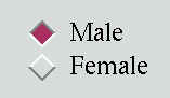
The indicator is the diamond-shaped part that turns red in the selected item.
The label is the text, although you can use an image or bitmap as the label.
If you prefer, you can dispense with the indicator. This makes the radiobuttons look like “push-push” buttons, with the selected entry appearing sunken and the rest appearing raised.
To form several radiobuttons into a functional group,
create a single control variable (see Section 52, “Control variables: the values behind the widgets”, below), and set the
variable option of each radiobutton to
that variable.
The control variable can be either an IntVar or a StringVar. If two
or more radiobuttons share the same control variable,
setting any of them will clear the others.
Each radiobutton in a group must have a unique value option of the same type as the control
variable. For example, a group of three radiobuttons
might share an IntVar and have values of
0, 1, and 99. Or you can use a StringVar control variable and give the radiobuttons value options like 'too hot',
'too cold', and 'just
right'.
To create a new radiobutton widget as the child of a root
window or frame named parent
w= tk.Radiobutton(parent,option, ...)
This constructor returns the new Radiobutton
widget. Options:
Table 29. Radiobutton widget options
activebackground | The background color when the mouse is over the radiobutton. See Section 5.3, “Colors”. |
activeforeground | The foreground color when the mouse is over the radiobutton. |
anchor |
If the widget inhabits a space larger than it
needs, this option specifies where the radiobutton
will sit in that space. The default is anchor=tk.CENTER. For other positioning
options, see Section 5.5, “Anchors”. For
example, if you set anchor=tk.NE,
the radiobutton will be placed in the top right
corner of the available space.
|
bg or
background | The normal background color behind the indicator and label. |
bitmap | To display a monochrome image on a radiobutton, set this option to a bitmap; see Section 5.7, “Bitmaps”. |
bd or borderwidth | The size of the border around the indicator part itself. Default is two pixels. For possible values, see Section 5.1, “Dimensions”. |
command | A procedure to be called every time the user changes the state of this radiobutton. |
compound
|
If you specify both text and a graphic (either a
bitmap or an image), this option specifies where
the graphic appears relative to the text. Possible
values are tk.NONE (the default value),
tk.TOP, tk.BOTTOM, tk.LEFT, tk.RIGHT, and tk.CENTER. For example, compound=tk.BOTTOM would position the graphic
below the text. If you specify compound=tk.NONE, the graphic is displayed
but the text (if any) is not.
|
cursor | If you set this option to a cursor name (see Section 5.8, “Cursors”), the mouse cursor will change to that pattern when it is over the radiobutton. |
disabledforeground | The foreground color used to render the text of a disabled radiobutton. The default is a stippled version of the default foreground color. |
font |
The font used for the text. See
Section 5.4, “Type fonts”.
|
fg or
foreground |
The color used to
render the text.
|
height | The number of lines (not pixels) of text on the radiobutton. Default is 1. |
highlightbackground | The color of the focus highlight when the radiobutton does not have focus. See Section 53, “Focus: routing keyboard input”. |
highlightcolor | The color of the focus highlight when the radiobutton has the focus. |
highlightthickness |
The thickness of the focus highlight. Default is
1. Set highlightthickness=0 to suppress display
of the focus highlight.
|
image |
To display a graphic image instead of text for this
radiobutton, set this option to an image object.
See Section 5.9, “Images”. The image appears
when the radiobutton is not
selected; compare selectimage,
below.
|
indicatoron |
Normally a radiobutton displays its indicator. If
you set this option to zero, the indicator
disappears, and the entire widget becomes a
“push-push” button that looks raised
when it is cleared and sunken when it is set. You
may want to increase the borderwidth
value to make it easier to see the state of such a
control.
|
justify |
If the text contains multiple lines,
this option controls how the text is justified:
tk.CENTER (the default), tk.LEFT, or tk.RIGHT.
|
offrelief
|
If you suppress the indicator by asserting indicatoron=False, the offrelief option specifies the relief style to be
displayed when the radiobutton is not selected.
The default values is tk.RAISED.
|
overrelief
| Specifies the relief style to be displayed when the mouse is over the radiobutton. |
padx | How much space to leave to the left and right of the radiobutton and text. Default is 1. |
pady | How much space to leave above and below the radiobutton and text. Default is 1. |
relief |
By default, a radiobutton will have tk.FLAT relief, so it doesn't stand out from
its background. See Section 5.6, “Relief styles” for
more 3-d effect options. You can also use relief=tk.SOLID, which displays a solid black
frame around the radiobutton.
|
selectcolor | The color of the radiobutton when it is set. Default is red. |
selectimage |
If you are using the image option to
display a graphic instead of text when the
radiobutton is cleared, you can set the selectimage option to a different image
that will be displayed when the radiobutton is set.
See Section 5.9, “Images”.
|
state |
The default is state=tk.NORMAL, but you
can set state=tk.DISABLED to gray out
the control and make it unresponsive. If the
cursor is currently over the radiobutton, the state
is tk.ACTIVE.
|
takefocus |
By default, the input focus (see Section 53, “Focus: routing keyboard input”) will pass through a radiobutton.
If you set takefocus=0, focus will
not visit this radiobutton.
|
text |
The label displayed next to the radiobutton. Use
newlines ('\n') to display multiple
lines of text.
|
textvariable |
If you need to change the label on a radiobutton
during execution, create a StringVar
(see Section 52, “Control variables: the values behind the widgets”) to manage
the current value, and set this option to that
control variable. Whenever the control variable's
value changes, the radiobutton's annotation will
automatically change to that text as well.
|
underline | With the default value of -1, none of the characters of the text label are underlined. Set this option to the index of a character in the text (counting from zero) to underline that character. |
value |
When a radiobutton is turned on by the user, its
control variable is set to its current value option. If the control variable is
an IntVar, give each radiobutton in
the group a different integer value
option. If the control variable is a StringVar, give each radiobutton a
different string value option.
|
variable |
The control variable that this radiobutton shares
with the other radiobuttons in the group; see Section 52, “Control variables: the values behind the widgets”. This can be either
an IntVar or a StringVar.
|
width | The default width of a radiobutton is determined by the size of the displayed image or text. You can set this option to a number of characters (not pixels) and the radiobutton will always have room for that many characters. |
wraplength | Normally, lines are not wrapped. You can set this option to a number of characters and all lines will be broken into pieces no longer than that number. |
Methods on radiobutton objects include:
.deselect()
Clears (turns off) the radiobutton.
.flash()
Flashes the radiobutton a few times between its active and normal colors, but leaves it the way it started.
.invoke()
You can call this method to get the same actions that would occur if the user clicked on the radiobutton to change its state.
.select()
Sets (turns on) the radiobutton.